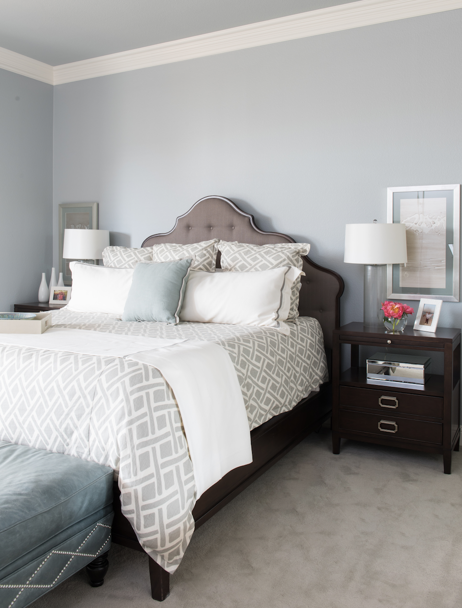
Floating Vanities ... all the rage or preparing for a flood?

For some time now, you might have seen a vanity... mounted several inches up onto the wall... with a space below.
Aka ... a floating vanity.

But why? You ask. Are we anticipating an overflow of the bathtub? Or bad plumbing? 

You know us better than that... We are here today to tell you why FLOATING VANITIES are ALL the rage and how amazing they really are.

1. It visually increases the wall height:
By floating the vanities, you are telling the eye to look up. And this makes the wall appear stretched and taller, therefore more luxurious, open and clean.

TCI Project

2. The idea creates more floor space in a small area.
Yes, while it may not be usable floor space, you have the appearance of extra, beautiful flooring and can accentuate a speciality tile or wood.
TCI Project

3. When doubled up and mirrored across a room, you create a simplistic freeing space.
We love this look across a bathroom. Just by raising these vanities up, we gave the room a breath of fresh air.
TCI Project

4. It creates a clean appearance.
Yes, while it may be a pain in the neck to clean (#sorry #beautyispain) it will APPEAR cleaner, fresher and beautiful.
TCI Project

Are you ready to raise the roof (i mean vanity)??

STYLE THAT: Nightstand Edition

It's time for another STYLE THAT series!

What are we styling today??
NIGHTSTANDS

Many people like to stack their books, papers, last minute items for out the door on their nightstands. But we are here to tell you today.... to hide that junk in the top drawer and allow the nightstand top to be gorgeous!

1. Always style with matching lighting:
Whether a beautiful table lamp set atop the nightstand or a wall sconce mounted above the furniture piece, matching lighting will always give your bed wall a sense of uniformity 
(TCI Project)


2. Use theme specific decor items as accessories:
This is especially helpful in a child's room where there may be a theme in play and adding an item of choice will bring the idea to life
(TCI Project)


3. Florals always Win:
Adding a fresh OR faux bouquet of flowers add another color to the scheme and life to the room
(TCI Project)

(TCI Project)


4. Think UP:
Styling a nightstand isn't limited to just the top surface. What is on the wall behind a nightstand makes a difference too. We suggest adding stacked art or a single mirror directly behind the table lamp in may circumstances
(TCI Project)


5. Layered Nightstands = More Places for Styling:
We love nightstands that have additional shelving. This brings the opportunity to add a simplistic item to each shelf. Always choose one of color to the scheme, and two neutrals.
(TCI Project)


6. GO SIMPLE:
Find a showstopper lamp that takes up the entire surface of your nightstand and let it be the star of the show!
(TCI Project)

Happy Styling!

Designing with Navy

A few years ago there were few people on the NAVY bandwagon. 

But give it some good designs and a few convincing presentations later... we've gotten to use one of our favorite colors in multiple projects and we LOVE the turn out.


WHY navy?? Read on to find out why this is the hottest "neutral" color around:

What are our favorites?
Sherwin Williams
Anchors Aweigh       and        Naval

1. Navy takes the place of a neutral YET adds a color to the playing field.


2. When paired with a bright color, you get a crisp and clean color scheme that can offset each other


3. It's earthy AND modern all in one.
Combine navy with hair on hide, iron and green moss plants and you've got yourself an earthy color scheme

Happy NAVY decorating!

Powder Bath Floor Play

We love changing up the ordinary to the unexpected in spaces you might not expect.

A powder bath is a space that is easily overlooked. Small, ordinary, and a place people view as an area to "save". 
BUT why make it less than satisfactory when it could turn it into something incredible?!

What do we do to achieve that?

LOOK DOWN. The floor.


There is so much you can do with a simple tile pattern. Whether it is creating a visual effect....


Or turning a stone on different angles....


A floor can set the tone by a milestone. Here we used a simple small mosaic to echo a wallpaper used throughout the walls!

Now don't overlook the ordinary and always look to the floor for inspiration!

Seeing RED on Valentines!

We showcased our favorite PINK designs last week and today ... on the day of all things red and lovely, we will show off our favorite RED designs.

Red USED to be a thing of the past... it may bring back late 80's early 90's designs in your head. But stay focused, because we are here to tell you that you CAN use red in a new and modern way.


No combos of red and green here, stay away from that. Choose a bright, crisp red to offset a black and white color scheme.


Keep the reds to pops.... in artwork, an accent table, wall decor


Or even bring it into a FUN space like we did in this media room!


A simple splash of red can transform an ordinary room from blah to BLING!


So don't be afraid of the red, embrace it with LOVE!

A Punch of Pink

We are ramping up for the pink and red holiday next week ... 
and in honor of Valentines, we bring you PUNCHES of PINK throughout several of our favorite TCI designs.

Many people are afraid of using pink in design because it is just too "girly" or meant for a "baby girl room". But we are here to show you it's actually NOT

You can use it in punches and pops without it being overwhelming ... aka flowers or a splash in artwork 


Here we used a simple art piece and floral to bring color to an otherwise neutral room


While the majority of the room may be based around another color family, we brought pink in as an accent to completely change up the scheme


Similar situation in this kids bathroom. Turquoise may have been the name of the game but with some fun accent tile and vases we brought the punch with pink.

Where would you like add a punch??

STYLE THAT: Bookcase Edition

Styling AGAIN!

I think many people worry most about their bookcases. What to put on them, how many books to use vs objects ... how much "dead space" to have vs how crowded to make them.

We are here to give you our top tips on bookcase STYLING!

1. Incorporate personal items with "styled" items:
Do you have personal books that mean something to you? Don't be afraid to mix in personal with hand picked items

2. Incorporate Greenery:
We love to add in pops of succulents or moss to add some color without being "in your face" or old times


3. Blank Space is Happy Space:
It IS ok to skip a shelf!! (insert shocked emoji face) We love to white wrap our books (or whatever color works for your room) and stack them sideways or lay them down for easy, beautiful styling

See full room below:

4. Series, Pairs and Like Items:
Use three of the same vases side by side of a uniform, unique and classic look!

Get to styling!
Powered by Blogger.